Friday 6 January 2012

Inspirations...

Each photographer I have studied that uses narrative in their work has always had a different approach to using it, experimenting with various techniques and inspiration. This in turn allowed me to introduce these into my own work, using alternative themes and taking into consideration situations I may not have considered previously. Such as Colin Gray, using a personal situation to document a time in his life. Tom Hunter, using perhaps a less conventional form in order to express narrative in his work, again using real life situations but instead of being personal, involves total strangers that he has merely read about and reverting them into visual pieces of art. Adi Ness who borrows iconic images from the history of art with an obvious homage to Di Vinci’s ‘Last Supper’, which hints at the soldiers future and the relationship between the soldier and his people and between the soldier and the state. The way in which they express their work by using various techniques differs also. This creates different moods within their work but is still relative to the subject matter. 

Lighting plays a massive role in these images, contributing to the feel and disposition.
Whereas Hunter plays more with natural light and shadows, Ness uses more colour then necessary giving his images an artificial feel. Gray saturates his images with colour but it’s the compositions that really make his work stand out, appearing quite distant at times and then very intense. Technically speaking these photographers use very little effects in their work. They concentrate more on narrative using basic techniques such as shallow depth of field to focus on specific parts. In my own images I have used this same technique. This enabled me to enhance the particular parts to give purpose to the narrative.

Keeping the images subtle but delivering clout is my purpose with my images. Like Hunter who earns much clarity in his work, and is slick and clever without being obvious, is the kind of image making I wanted to achieve.
Taking inspiration from Colin Gray and Tom Hunter I have produced a small series of photographs using narrative to communicate a story.
I took from Gray the use of presenting images in a sequence. This is reminiscent of reading a novel, which I have attempted to recreate with my own images. I decided to exhibit them in a series of three, to illustrate a beginning, middle and an end.
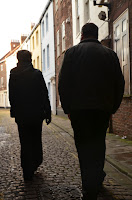
Alike to Hunter who uses elementary archetypes to achieve structured images which often reveal a very despondent and true account of everyday life, I have taken inspiration from music and applied my own interpretation. For example, the images below relate to the song ‘Heaven Can Wait’ by Charlotte Gainsbourg (which I highly recommend listening too).

Please observe and consider the images and let me know what conclusion you draw from them. I’ll be interested to know your thoughts…



Thursday 5 January 2012

Tom Hunter Study

The approach Tom Hunter has on his work is engaged and deliberate. He provokes thought and encourages his audience to consider and observe his images. He features social groups and stereotypes as his subject matter, seeming to connect with the audience, often staring directly into the lens. However, it does not appear intimidating, unless Hunter intends it to be. He has an interesting notion and insight into photography, using contrived scenes sometimes of an historical nature or merely re-enactments of daily life. He uses bold, symbolic gestures depicting scenes from a story or a chapter in a book. For example, Hunter’s interpretation of Millais ‘Ophelia’ from Shakespeare’s Hamlet.  Or, some of his work being the result of an exaggerated link between newspaper headlines.
Hunter’s images are very visual, encouraging the audience to seek answers within them.
His use of light often plays a major factor in his work, creating mood and a sense of what the images are about.

He uses well known or obvious material to inspire his work.  Interpreting paintings and information and transforming them into narrative based images.
Hunter’s work tends towards social and political issues and focuses on unusual social stereotypes as subject matter treating individuals with a sense of self-worth, often using metaphors without including humour or irony, common in contemporary art. He also has a raconteur attitude to his work using contrived scenes to make bold statements that resonate with a broad range of the contemporary audience.

He delivers his work with super-sleek presentation and technique. Every element he introduces into his images is deliberate; the composition, the subject, lighting and focal point.
He uses narrative in all his photography, making his work have a unique stamp, his stamp. His use of both contemporary photography juxtaposed with historical references is very intriguing. I enjoy his use of this especially in his series of images based on Shakespeare’s A Midsummer Night’s Dream, with his own modern twist again using light to create mood and atmosphere. He never strays too far from the purpose of using historical references, still keeping a similar theme, but just transporting his images to places that the audience can relate too.
I enjoy his fearless approach to photography, always delivering strong images that tells stories in a graphic manner.

I find Hunter’s inspiration for his work somewhat unique. Using both real life situations and fictional creations from plays and poems. This shows to me his interest in both photojournalism and literature, turning it into visual art. This also encourages me to consider using similar things for inspiration such as music.

Colin Gray 'In Sickness and In Health' Exhibition - Nov 2011/Feb 2012

In his earlier work, Gray produces work of a more dream-like quality, for example in the series of ‘The Parents’; some images depict being submersed by water. He worked more with props and illusions and I believe Gray wanted to produce work that was more art based. 
Whether his proclivities tend more towards art and design as apposed to basic photography is either self-evident in his work depending on your observation.
Some of his work appears humorous even in the series of photos ‘In Sickness and in Health’. It has an essence of storytelling about it, documenting the illness and eventual death of his Mother. What Colin Gray tries to achieve is to show his Mother as a healthy young woman. He does this by having her hold a photo of herself, juxtaposing old and young together. The fact that the viewer is merely seeing the hands of the person holding the photo gives the image an eerie essence. But I feel that, technically, the composition was exactly right; seeing the aged hands of his Mother holding a photo of her younger self.

Though this series of photos depicts a subject some of us deem ‘morbid’, I feel the way in which Gray composes his work, he deals with it in a sensitive manner.
I believe the purpose of Gray’s work was solely for his own contemplation and resolve. But also I believe Gray wanted people to see his Mother not only as a dying old woman, but someone who once was full of life, grace, humour and purpose. This series of images juxtaposed with images from the series; ‘The Parents’ explores this accurately, seeing both parents carefree in almost cinematic compositions moved to more reserved observations in his later work. His work challenges the controversial exploration of death and documents it well.

I like his element of photojournalism, documenting a particular time, almost telling or revealing part of a story in each shot. His use of narrative allows him to produce his work in a series of images as though each image is another chapter in a story, using visual references instead of words.
Using Gray’s same vision, I would also like to produce work of a similar nature. Taking inspiration from music and telling a story in a series of visual images.

If you haven't already, I urge you to see this exhibition. The exhibition itself is cleverely designed and the images thought provoking! Enjoy!

Francesca Woodman Exhibition - Ferens Art Gallery - June/October 2011

Woodman’s work is not conventional but explores issues of gender and self, looking at representation of the body in relation to its surroundings.
Woodman uses people as objects or as narrative in her work, but often conceals their faces giving the images an uneasy feeling. It makes the viewer question her motives for doing this as she also appears in much of her own work. Is this to exploit the issues of identity or merely someone trying to escape or hide?

Looking at Woodman’s work can often be a disconcerting experience which replicates the work of Bellocq’s ‘Storyville Portraits’ of New Orleans prostitutes. Alike to Bellocq, Woodman uses nudity to portray vulnerability whilst again touching on the issues of identity and self-worth. Brandt also experimented with narrative in his work, posing his wife, Eva Baros, as a night walker in the red light district of Hamberg. His images displayed an aspect of realism which was modern and crude.

Like the majority of her work, the lack of colour emphasises the tone and form. She uses little light which creates shadows and extenuates the objects within, giving the image an eerie mood. 

Another artist who also appears in his work is Ross Sinclair. He also uses his work as narratives and ‘combines text, colour and graphics to test notions of personal and national identity and questions the notion of truth in life and art itself’. Alike to Woodman he uses himself as the subject matter expressing strong, social opinions and commentary, whilst exploring identity. Sinclair also obscures his face from view. In his series of images from his ‘Real Life’ collection ‘Duff House’, it seems as though you are a spectator in his world, watching him pass from room to room in a grand and majestic home, tattooed and half naked, seemingly disconnected with his surroundings. This suggests a paradox of the character with his environment.

Unlike Woodman, Sinclair uses strong, powerful colours in his work. This is to the images advantage as each display grandeur and elegance. Woodman’s lack of colour also benefits her work. Though both Sinclair and Woodman’s subject matter and reasons for their art are similar, their way of projecting their work are completely contradictory.

Beginnings...

Well, this is my very first blog! I want to use this space to discuss, inform and hopefully encourage.
I have a great interest in Art and how it influences and inspires.
I hope to write about exhibitions, provoke ideas and opinions and to discuss them.
After all, that's what Art is all about!
So, please stay tuned...